Showing posts with label Instore Display. Show all posts

Sunday, 22 December 2013

Instore Display: petit h

I was reading this compilation of some outstanding blogs from the book 'Style Feed' (Such an irony, I know right?) by William Oliver and Susanna Lau (aka Style Bubble or Susie Bubble) when I came across this. Prior to this, through my research days with my French boss, I had learnt the side of thriftiness of French people despite Paris being the oldest known place housing probably the most number of luxury brands and couture houses in the world. And coming from Hermes with their diffusion line or upcycling project, I truly hope it will bring awareness and encourage people to actually start their own upcycling projects!
  
In any case, even you're not too much of an environmentalist (I'm still not sure if I can count myself as one...), take a look at the marvelous VM display they have put up for the store. From the wall consisting of wooden blocks that can be pushed in and out to create rhythm, hang products or provide fresh outlooks each time to the colored leather fringes that encloses each selling space, making it personal, every space has something for a shopper to explore and be amused by.


Even their window displays are made of props from the scrapes in the 'laboratory', as Madame Pascale Mussard calls the petit h atelier, a term that I totally embrace because of the experimental creative freedom in this word. My discovery of this unique store comes as a little late though (petit h has already made its tour to Singapore while I was in London), but I will definitely jot this down a wish list to fulfill when I go Paris again!

xoxo,
Yuhan

Thursday, 12 December 2013

Instore Display: Robinsons at Heeren

Alrights, I just posted on TANGS, a departmental store. And as my regular readers would know, I usually would do windows battle if I were to compare two similar stores. But the reason why I had decided not to, is mainly because I feel that they both have their merits. In fact, they are both bringing in a trend for departmental stores that is really commendable and I hope other stores can also follow in their footsteps. And guess what, I am actually an avid fan of departmental stores!

I'm sure I've seen this brand in Selfridges for their theatrical makeup but I don't recall what the name is? But interesting counter and they even have special makeup sessions with models to showcase new makeup trends!

This mega snow globe with normal sized Christmas trees, surrounded by the dome glass cases as seen in the TANGS store as well. I'm not so sure if it's the best place to display the glass cases, as most people are distracted looking at the globe and 'snowing' lights from above, or taking pictures with the globe, which prevents others from looking at the cases. 

Fragrances. Open shelve displays of alternate heights make the area look more spacious and the display flow or rhythm more interesting. 

The open cashier counter. Heard that this concept is new. Looks really grand. 

The jewelry room with Moet and Chandon Champagne. An excellent match of the fine life! They large champagne glasses immediately caught my attention. And I absolutely loved the table displays in there, some curated, some just displayed by the brand. The room is segregated from the rest of the shoes and bags department, allowing some coziness and intimacy from the crowds out there.


Instore Display: Tangs and Co.

I was so caught up with the set-up of departmental store last month and with other stuff that took up the most of last month that I totally hadn't had the time to update this blog! Sorry guys!

I owe Tangs a write-up, I certainly do. By the way, for international readers, Tangs and Co. is a local departmental store that carries both International big brands and local designers. It has two outlets, one right in shopping district, Orchard Road, right opposite Ion Orchard, and the other in Vivocity, where you will pass by en route to Sentosa by train.

Ever since they did a renovation on level basement 1 and level 1 for the orchard store, the whole departmental store looks like a totally different place altogether! It's refreshing, intriguing, and makes you want to go all over the place to explore what's around. Take a look at the in-store set-ups and you'll see what I mean...

Fiercely sexy lingerie

These domed glass cases with curated items look elegant and pleasing to the eye. 

This is AH-MAZING! The geometric shapes are in sync with the prints themes the store is having for summer.


Tang's in store brand, Martina Pink, with a nice feminine bow made of colored cloth pegs.

Their Christmas in-store designs is even more eye-catching and fabulous! Do go have a look!

xoxo,
Yuhan

Tuesday, 22 October 2013

Shopper STOPPER: Mind The GAP

GAP. At first glance, this brand, pretty well known for their pretty pricey basics and jeans almost has zero appeal except perhaps their best-selling jumpers or clothing with the word 'GAP' on it. Doesn't help that it is wayyyyy more expensive here in SG as compared to the States and we now have Uniqlo which provides every bit of quality with every cent paid. 

But apparently, GAP has upped their game in their new windows. I love this boxed up concept, it helps brings focus to that particular key product you want the customer to SEE. This seems to be trending now considering that H&M has a similar concept in their window (See below), however GAP goes one notch higher by using their signature blue light + the striking "Colour a Chord" makes it almost impossible to ignore the otherwise pretty dull colour palate of the display.

H&M's window using a magnifying glass-like prop to highlight the key products. 

I love this store front! This space looks wide, especially the walkway surrounding the four mannequins on GAP decorated plinths seducing the customer to walk in and take a look at the outfits and also the campaign poster at the back. Also, the two racks on each side have exactly the products dressed on the mannequins, convenient for the male customers to search for what they want.

And for their children's store, it's even brighter and more fun! Being in London, I was well aware that 'back to school' is a common window theme for many stores there but I haven't seen one in SG, that was until I saw this: 'Back to Cool!' Makes going back to school a little less painful, don't you think?
I can feel the EXCITEMENT in the mannequins!

On the other side is more for toddlers, light and small little kids, GAP has chosen to hang the outfits up, as with the floating balloons with a pink heart. Awwww... just like how every kid is their parents' love.

The extra pic! Took this while I was in London, which coincidentally was when the Royal couple, Prince William and his Duchess of Cambridge, Kate gave birth to Prince George. Love the suspending handkerchiefs, (reminds me of graduation) and totally puts one into celebratory mood!  And look! Even the colours are purposely chosen to reflect UK's royal colours: Red, white and blue. Shows effort put in to incorporate into the London culture despite being a US retail company.

xoxo,
Yuhan

Thursday, 10 October 2013

Trending Windows (Color): Turquoise x Store Analysis: Rimowa

One of the questions that I get asked by friends when I tell them I want to be a visual merchandiser is this: 

"So is it only about fashion/clothes?"

Of course not! Visual merchandising is very simple terms is all about ARRANGEMENT, with the purpose of making it APPEAL to the customer, and SELL! So besides your general clothing store, every single item that can be sold can hire a VM! Even when it comes to supermarkets selling food, there's a lot of thought into which items are place where and which level of shelves. Okay I digress. But my point is when windows are not about clothes, more creativity can be explored! Because clothes usually require mannequins for appeal, whereas items below can be positioned in interesting manners or employ certain themes to bring out the emotional appeal.  

Jewel tones have been trending for a while now. And I must say, for me, my favorite has to be turquoise because it reminds me so much of the sea! (Probably has got to do with my horoscope...) And Rimowa and Mont Blanc used it best!


I loved the voyage theme with with the lighter turquoise as the backdrop with fairytale-like wind patterns. So everything is pretty monotonous except for the contrasting dark grey metallic suitcases which makes it so much more attractive! Had it been placed beside black and navy suitcases I wouldn't have liked it so much.


This is actually the extended right side of the long window with various sizes of turquoise luggage they are selling. Lovely right? The color appeal here is very strong, with the contrasting flame red mats adding onto the focus. I believe the second luggage from the left is purposely left horizontal (i.e. lying on the broader surface) to open up the view of the consumer to the multi-colored display of luggage at the back.

Now look at the right side. Instead of just normal layers of shelving like those boring supermarket shelving, the levels are half-alternated, with some boxed up lit shelves to highlight some key products, which make all these similar looking rectangular luggage display way more interesting than those just stacked together from small to large, and by singular colors. During the time while I was taking the photos, a few passerby had stopped to look. SUCCESS! Making a shopper a stopper!

In the Mont Blanc window below, the use of the color is more subtle. Instead of having full coverage of the color, it is used as font of the poster with black illustrations and light brown feathers, all having the flow and color of ink. But this striking color makes it hard to ignore, and brings the viewer down to the similarly illustrated book at the left before drawing attention to the product. A clever one!


xoxo,
Yuhan

Monday, 16 September 2013

The un-intended intention of MIRRORS in-store.

It's been more than once now.

I caught an eye of an item that would have not be seen had I not looked into the mirror, by accident.

By accident, I meant it was just a glance, for a moment. And caught a reflection. And proceeded to find something lovely I hadn't otherwise noticed.

Especially in a small & crammed store, where everything is packed closely, with sidewalks so narrow that the products become too close in-your-face for viewing, this might actually be a good strategy.

The question is what mirrors to put, where and how to best take advantage of this!

If you have sufficient space for an ordinary vertical mirror (for customers to see how they look in it):
Try a mirror with interesting frames or edges that capture attention. A mirror like any of these below instantly becomes the attention of the entire shop. And which woman doesn't like pretty things?

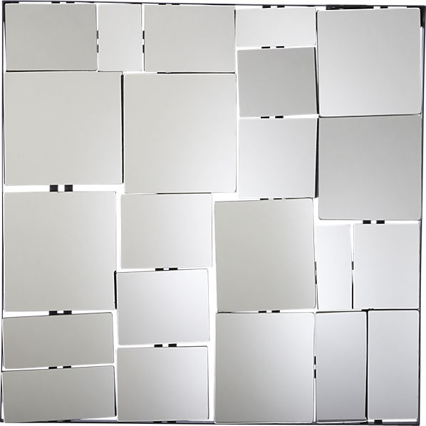
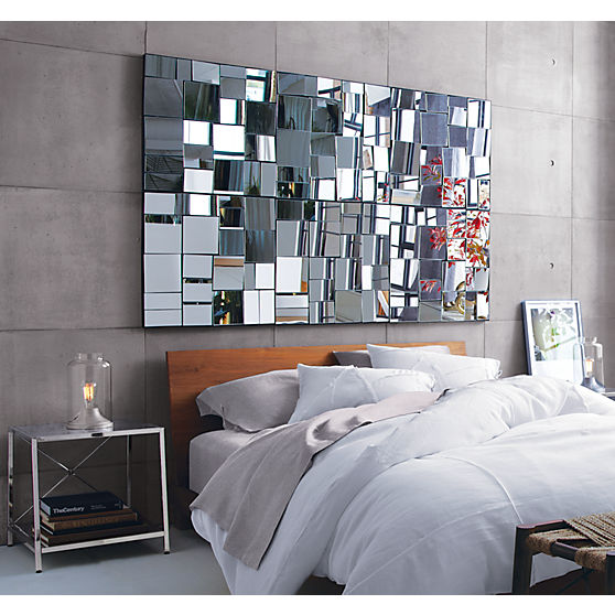
Or why not try this? The slightly angled little mirrors that form the Perspective mirror reflects the entire space from a slightly different angles. The only problem is if the space has too much colours or is too cluttered, it might make it worse.
Perspective Mirror, from CB2 
PerspectiveMirrorF8
 

Similar concept. But this is great 'cause you can DIY! And put promo ads on some of the mirrors!


I love this one! Looks like something might be inside and invites you to look in!


For an accessories store, especially if you have an extra empty wall!


Besides having mirrors, cabinets with a reflective surface works too! I remember just seeing a bookshelf at IKEA with this similar reflective surface.
(Note: Daily wiping is needed to maintain shine.)


So there you go!

These mirrors should be either placed at:
1. In the middle of the two sides of the store OR
2. Cold spots where the customers tend not to go to help increase the traffic.
3. Where walk spaces are narrow (increase the appearance of space and also accidental viewing of items). 

Lemme know if it works for your store! And other uses you guys have for your mirrors!

xoxo,
Yuhan


Tuesday, 3 September 2013